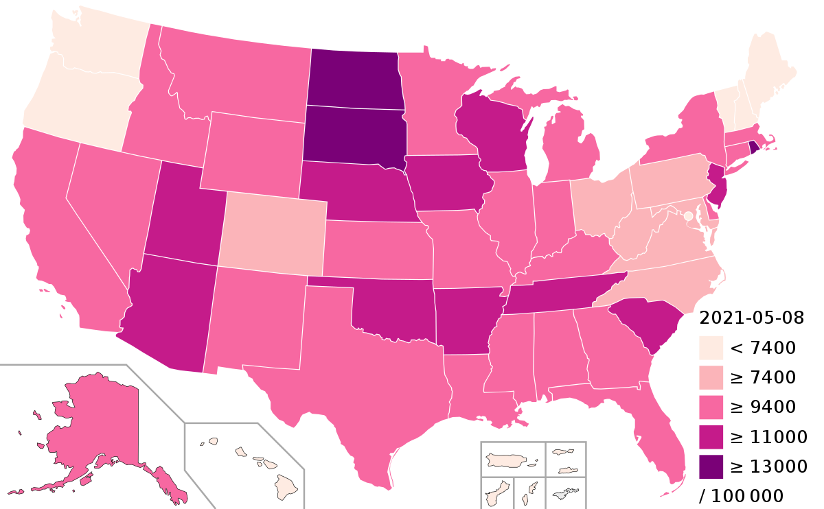
United States of America : COVID19, Country Profile
12 May 2021 | Wednesday | Analysis

Image Source : wikipedia
What is important to note about these case figures?
- The reported case figures on a given date do not necessarily show the number of new cases on that day – this is due to delays in reporting.
- The actual number of cases is likely to be much higher than the number of confirmed cases – this is due to limited testing. In a separate post we discuss how models of COVID-19 help us estimate the actual number of cases.
United States: Biweekly cases: where are confirmed cases increasing or falling?
Why is it useful to look at biweekly changes in confirmed cases?
For all global data sources on the pandemic, daily data does not necessarily refer to the number of new confirmed cases on that day – but to the cases reported on that day.
Since reporting can vary significantly from day to day – irrespectively of any actual variation of cases – it is helpful to look at a longer time span that is less affected by the daily variation in reporting. This provides a clearer picture of where the pandemic is accelerating, staying the same, or reducing.
The first map here provides figures on the number of confirmed cases in the last two weeks. To enable comparisons across countries it is expressed per million people of the population.
And the second map shows the growth rate over this period: blue are all those countries in which the case count in the last two weeks was lower than in the two weeks before. In red countries the case count has increased.
Most Read
- How Does GLP-1 Work?
- Innovations In Magnetic Resonance Imaging Introduced By United Imaging
- Management of Relapsed/Refractory Multiple Myeloma
- 2025 Drug Approvals, Decoded: What Every Biopharma Leader Needs to Know
- BioPharma Manufacturing Resilience: Lessons From Capacity Expansion and Supply Chain Resets from 2025
- APAC Biopharma Review 2025: Innovation, Investment, and Influence on the Global Stage
- Top 25 Biotech Innovations Redefining Health And Planet In 2025
- The New AI Gold Rush: Western Pharma’s Billion-Dollar Bet on Chinese Biotech
- Single-Use Systems Are Rewiring Biopharma Manufacturing
- The State of Biotech and Life Science Jobs in Asia Pacific – 2025
- Asia-Pacific Leads the Charge: Latest Global BioSupplier Technologies of 2025
- Invisible Threats, Visible Risks: How the Nitrosamine Crisis Reshaped Asia’s Pharmaceutical Quality Landscape
Bio Jobs
- Sanofi Turns The Page As Belén Garijo Steps In And Paul Hudson Steps Out
- Global Survey Reveals Nearly 40% of Employees Facing Fertility Challenges Consider Leaving Their Jobs
- BioMed X and AbbVie Begin Global Search for Bold Neuroscience Talent To Decode the Biology of Anhedonia
- Thermo Fisher Expands Bengaluru R&D Centre to Advance Antibody Innovation and Strengthen India’s Life Sciences Ecosystem
- Accord Plasma (Intas Group) Acquires Prothya Biosolutions to Expand Global Plasma Capabilities
- ACG Announces $200 Million Investment to Establish First U.S. Capsule Manufacturing Facility in Atlanta
- AstraZeneca Invests $4.5 Billion to Build Advanced Manufacturing Facility in Virginia, Expanding U.S. Medicine Production
News
Editor Picks


